Sunday, August 17, 2014

Polymer Track and Holdpulse Events


I confess that, until last night, I was largely unaware of Polymer's normalized events. I had seen them (and even used them) in passing, but had not given them much thought. The Simple Event Example from the Polymer team gives a nice feel for what they are, but I would like to play with them a little more before moving on to other topics.

First, I am curious about the “holdpulse” event. As the name implies, it generates events for as long as the pointer (mouse or touch) is down. But what properties are supported by such an event and how might I use them? To answer those questions, I add a Polymer on-holdpulse handler to a card element:
        <div class="card" layout horizontal
             hero-id="{{selectedTopping}}"
             hero
             on-holdpulse="{{pulse}}"
             on-tap="{{transitionTopping}}">
          <!-- ... -->
        </div>
And, in that bound pulse() method, I simply debug:
Polymer('x-pizza', {
  // ...
  pulse: function(evt) {
    debugger
  },
  // ...
});
After initiating a hold, I find evt in the Scope Variables tab of Chrome's JavaScript console:


Of note in here is that the time is not exactly 200ms. So, if I wanted to send ripples from the current location on some modulo of time, I would have to round the value first:
Polymer('x-pizza', {
  // ...
  pulse: function(evt) {
    //debugger
    if (Math.round(evt.holdTime/100)*100 % 1200 == 0) {
      this.$.ripple.downAction({x: evt.x, y: evt.y});
      var that = this;
      setTimeout(
        function(){
          that.$.ripple.upAction();
        },
        800
      );
    }
  },
  // ...
}
I am also curious about the “track” events. They seem like a cheap way to implement drag events in Polymer elements (among other applications). So I create a dirt simple track icon to test it out:
<polymer-element name="x-pizza">
  <template>
    <!-- ... -->
    <div id=track
         style="position: absolute; top: 50px; right: 50px; width: 25px; height: 25px; background-color: orange; cursor: pointer;"
         on-track="{{track}}"></div>
    <!-- ... -->
  </template>
  <script src="x_pizza.js"></script>
</polymer-element>
I half expected (OK, to be honest, I 100% expected) the X-Y position to be normalized into x and y properties on the event. But they are available on pageX and pageY like normal mouse DOM events:
Polymer('x-pizza', {
  // ...
  track: function(evt) {
    evt.target.style.top = evt.pageY + "px";
    evt.target.style.left = evt.pageX + "px";
  },
  // ...
}
With that, I have a simple drag working.

In the end, these Polymer events work pretty much like a developer might expect. And yes, they work quite well on touch devices as well.


Day #155

Saturday, August 16, 2014

Don't Mix Browser Events in Paper (Polymer)


I could play with Paper Elements and the benefits of adhering to Material Design all day:


But the gods of my chain and Jerry Seinfeld would frown on that, so...

Up today, I worry about event propagation in paper elements. Specifically, when I add a pizza topping to an <x-pizza>, the event should not trigger the pizza toppings card to transition back to its initial “chip” state:


The ingredients are core-item elements whose on-click attribute points to the add() method on the backing class:
<polymer-element name="x-pizza-toppings" attributes="ingredients name">
  <template>
    <!-- ... -->
    <template repeat="{{ingredient in ingredients}}">
      <core-item
         scale-up
         id="{{class_name(ingredient)}}"
         icon="add-circle"
         label="{{ingredient}}"
         on-click="{{add}}">
      </core-item>
    </template>
  </template>
  <script src="x_pizza_toppings.js"></script>
</polymer-element>
So my first thought is to prevent event propagation in every conceivable way:
Polymer('x-pizza-toppings', {
  // ...
  add: function(e) {
    this.model.push(e.target.label);

    console.log('stop the events!')
    e.preventDefault();
    e.stopPropagation();
    e.stopImmediatePropagation();
    return false;
  },
  // ...
});
Unfortunately, it seems that my first instinct is incorrect. Actually, it turns out to be just a little off.

The transition between chip and card (and back) are both listening for tap events, not click events:
    <core-animated-pages selected="{{toppingsListOrDetails}}" transitions="hero-transition">
      <section>
        <div class="chip-container"
             hero
             on-tap="{{transitionTopping}}">
          <!-- Chips go here... -->
        </div>
      </section>
      <section>
        <div class="card" layout horizontal
             hero-id="{{selectedTopping}}"
             hero
             on-tap="{{transitionTopping}}">
          <!-- Chips go here... -->
        </div>
      </section>
    </core-animated-pages>
Tap events are one the Polymer normalized events, which aid in cross-platform and cross-device development. The tap event work for both mouse and finger, firing when the pointer goes down and up again.

So the fix is to adopt a consistent approach to events:
    <template repeat="{{ingredient in ingredients}}">
      <core-item
         scale-up
         id="{{class_name(ingredient)}}"
         icon="add-circle"
         label="{{ingredient}}"
         on-tap="{{add}}">
      </core-item>
    </template>
And then, I can reduce the event propagation to simply stopPropagation():
Polymer('x-pizza-toppings', {
  // ...
  add: function(e) {
    this.model.push(e.target.label);
    e.stopPropagation();
  },
  // ...
});
With that, I can add toppings to my heart's content:


It only makes sense to be consistent with events. This is, after all, the point of normalizing some of the events in Polymer. Hopefully I will take this lesson to heart in the future.


Day #154

Friday, August 15, 2014

Don't Absolute Position in the Hero Transition


The “hero” transition between chip and card is great fun:


I enjoyed exploring it (and the source demo from which I borrowed liberally). I enjoyed playing with the chip and cards even more. With relatively little effort, I was able to create what Material Design refers to as “motion with meaning.”

But there are at least two issues that I noted after an hour or so of clicking (it really is that fun). First, the hero transition of the half-a-pizza icon is not as smooth as it might be—especially at the end where it jumps down. Second, when I click a pizza topping to add to the pizza, the click event continues to propagate until the card closes.

I like to pick the harder battles first (even though the easy battles never seem to be easy). In this case, I guess that I can simply stop normal event propagation to solve the second problem. Since this Material and Paper Elements stuff is still new to me, that seems the harder of the two problems, so I start with that.

My furst guess is that the problem is related to nesting three elements. In my chip, I am “hero-ing” the entire chip, the top of the chip that contains the color, and the icon:


The hero IDs indicated tell Paper elements how to map visual elements during transitions. The card ultimately gets assigned matching hero IDs like so:


The first_half hero ID maps the chip for first half pizza toppings to the card for first half toppings. The icon in the chip maps to the icon in the card, which only seems to make sense. It is a little odd that I mapped the yellow top in the chip to the <div> that holds the icon in the card. Perhaps that is where things are going wrong?

I think I had meant to map the yellow chip top to the yellow card side. So I move the “color” hero ID to the side in the card:
        <div class="card" layout horizontal
             hero-id="{{selectedTopping}}"
             hero
             on-tap="{{transitionTopping}}">
          <div class="card-left"
               style="background:{{selectedColor}};"
               hero-id="{{ selectedTopping }}-color"
               hero></div>
          <div class="card-right" flex>
            <div layout horizontal center>
              <div class="card-icon"
                   style="background-color:{{selectedColor}};">
                <core-icon
                   src="/assets/{{selectedTopping}}.svg"
                   hero-id="{{ selectedTopping }}-icon"
                   hero></core-icon>
              </div>
              <div flex>
                <!-- Topping selectors here...
              </div>
            </div>
          </div>
        </div>
The effect is actually more satisfying than the previous hero ID mapping:


But the the icon transition back is no better.

After much further fiddling, I find that I can get everything fixed if I simply remove absolute positioning on the elements being transitioned. I really wish this had occurred to me earlier because it took me a lot of digging. On the plus side, I got to use the break-on-element-attribute change in Chrome inspector.

In retrospect, maybe this should have occurred to me sooner as the chip icon was the only thing being absolutely positioned:
      .chip-top .chip-icon {
        position: absolute;
        left: 50px;
        bottom: 75px;
      }
The fix is to simply change that to use plain old padding:
      .chip-top .chip-icon {
        padding-top: 60px;
        padding-left: 50px;
      }
With that, I get a beautiful transition back and forth between chip and card:


So the moral of the story is don't use absolute position on hero (and possibly any) transitions in Paper elements. Also, don't use yellow for the demo color -- it can be a little hard to see, but hard to change when you don't notice until you're nearly done with a post (sorry about that).

Up tomorrow: I try to solve the “easy” problem (please let it be easy).


Day #153


Thursday, August 14, 2014

Chip and Card Hero Transition in Material (Polymer)


Tonight I continue exploring Material Design, the design approach behind the new Paper Elements in Polymer (as well as many Google properties). I remain uncertain if Material can be a general purpose design solution (it looks very Googly), but I am already convinced that that ideas baked into Material are powerful.

Last night I explored one of the core principles of Material in my <x-pizza> Polymer, that of “bold, graphic, and intentional.” The result, which heavily copies from one of the core-animated-pages demos, looks like:
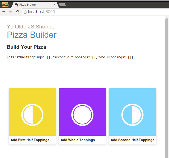


The colors are definitely bold. The icons and the wording are intentional. The icon and these “chips” (as they are called in Material) are very graphic. And I like them very much. Even though I mostly copied them, I am already attached to them.

It should be noted that, even though I am incorporating Material design in a Polymer element, I am not actually using Polymer to build the chips. They are very much old school <div> tags:
      <section>
        <div class="chip-container">
          <div class="chip">
            <div class="chip-top" style="background:#f4db33;">
              <div class="chip-icon">
                <core-icon src="/assets/first_half.svg"></core-icon>
              </div>
            </div>
            <div class="chip-bottom">
              <div class="chip-title">Add First Half Toppings</div>
            </div>
          </div>
          <!-- Other topping chips here ... -->
        </div>
      </section>
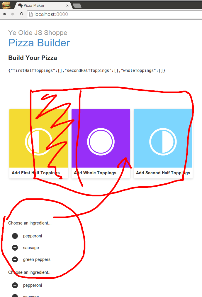
Tonight, I include a little Polymer goodness to complete the chips. In Material, chips are small representations of a more complex entity. In this case, they represent the UI to select toppings for various halves of the pizza. I already have those selectors from a previous (tab-based) implementation. I need too pull them into a “card”:


I also need to add motion, which is another core principle of Material. More precisely, “motion provides meaning” in Material. In this case, the chip will transition to card which both “reinforces the user as prime mover” and “focuses attention and maintains continuity.” To accomplish that, I need a little help from the core-animated-pages Polymer element. I am also going to shamelessly copy from that demo because it's pretty cool.

The idea behind the change from chip to card is to wrap the list of a chips and the details card inside a <core-animated-pages> element. When a user action changes the selected value of details or list, the <core-animated-pages> element will take care of transitioning between chip and card with whatever transition scheme I want. In the case of the demo and in my shameless copy, I use hero-transition. I am not quite sure what that does, but with a name like that, it must be awesome.

So I wrap last nights chip list section and a new details card in <core-animated-pages>:
    <core-animated-pages selected="{{toppingsListOrDetails}}" transitions="hero-transition">
      <section>
        <div class="chip-container">
          <div class="chip">
            <div class="chip-top" style="background:#f4db33;">
              <div class="chip-icon">
                <core-icon src="/assets/first_half.svg"></core-icon>
              </div>
            </div>
            <div class="chip-bottom">
              <div class="chip-title">Add First Half Toppings</div>
            </div>
          </div>
          <!-- Other topping chips here ... -->
        </div>
      </section>
      <section>
        <div class="card">
          <!-- Details here ... -->
        </div>
      </section>
    </core-animated-pages>
The rest of the effort is assigning the hero attribute and lining up the hero-id attributes. For example, I give the first-half topping selector a hero-id of "first_half":
    <core-animated-pages selected="{{toppingsListOrDetails}}" transitions="hero-transition">
      <section>
        <div class="chip-container" hero on-tap="{{transitionTopping}}">
          <div class="chip" id="first_half_chip" hero-id="first_half" hero?="{{selectedTopping == 'first_half' }}">
            <div class="chip-top" style="background:#f4db33;">
              <div class="chip-icon">
                <core-icon src="/assets/first_half.svg"></core-icon>
              </div>
            </div>
            <div class="chip-bottom">
              <div class="chip-title">Add First Half Toppings</div>
            </div>
          </div>
          <!-- Other topping chips here ... -->
        </div>
      </section>
      <section>
        <div class="card">
          <!-- Details here ... -->
        </div>
      </section>
    </core-animated-pages>
I also have to indicate that it is a “hero” when the selected topping is "first_half". Without that, the only hero transitioning is the chip list container. The hero? “predicate attribute” does this. Normally, I would just use hero to indicate that a thing always transitions. But I only want the individual cards to transition under certain conditions, which hero? represents.

This is only part of the hero transition. The transition starts with the identified chip. I need the card to match up with the same hero-id as the the chip (otherwise it assumes that it is not included in the transition). For that, I use a Polymer bound variable:
      <section>
        <div class="card" layout horizontal hero-id="{{selectedTopping}}" hero on-tap="{{transitionTopping}}">
        </div>
      </section>
Updating that selectedTopping instance variable is a bit ugly. I resort to checking click event target to see if each card contains it:
Polymer('x-pizza', {
  toppingsListOrDetails: 0,
  selectedTopping: null,

  transitionTopping: function(evt) {
    if (this.$.first_half_chip.contains(evt.target)) {
      this.selectedTopping = 'first_half';
      this.selectedToppingIndex = 0;
      this.selectedColor = '#f4db33';
    }
    // Do the same for whole and second half...
    this.toppingsListOrDetails = 1;
  },
  // ...
}
I begin to understand why the demo page author made some of the design and coding decisions that they did. They did an admirable job of keeping the code simple. I wonder if I might be able to do the same with my code.

Regardless, this does the trick. The end result looks something like:


I really like that. If I couple this with the SVG pizza (in place of the JSON pizza representation), I could really have something here.


Day #152

Wednesday, August 13, 2014

Custom SVGs for Core-Icons in Polymer


After last night, I have a nicely animated <x-pizza> Polymer element:


The animation and elements come courtesy of Paper and Core elements from the Polymer project. I think they work together well to be bold & graphics as well as providing motion with meaning (core tenants of Material Design).

Perhaps the most exciting aspect of all of this is that I used no code. The <x-pizza> element still has code logic for building pizzas, but the tabs and motion of the pages movings comes entirely from Polymer elements:
    <paper-tabs selected="0" id="tabs">
      <paper-tab id="first_half_tab">
        <p>First Half Toppings</p>
      </paper-tab>
      <paper-tab id="second_half_tab">
        <p>Second Half Toppings</p>
      </paper-tab>
      <paper-tab id="whole_tab">
        <p>Whole Pizza Toppings</p>
      </paper-tab>
    </paper-tabs>
    <core-animated-pages selected="{{$.tabs.selected}}" transitions="slide-from-right">
      <x-pizza-toppings id="firstHalfToppings"
                        name="First Half Toppings"
                        ingredients="{{ingredients}}"></x-pizza-toppings>
      <x-pizza-toppings id="secondHalfToppings"
                        name="Second Half Toppings"
                        ingredients="{{ingredients}}"></x-pizza-toppings>
      <x-pizza-toppings id="wholeToppings"
                        name="Whole Toppings"
                        ingredients="{{ingredients}}"></x-pizza-toppings>
    </core-animated-pages>
As cool as that is, I think it might only be a start. There may be more appropriate material metaphors that fit what I am trying to accomplish with the pizza toppings. Toward that end, I would like to start with a “chip” and page approach similar to the music example in the core-animated-page demos.

Chips, in Material, are small items that represent a more complex entity. In this case, I might represent the relatively complex pizza toppings chooser with a simple chip. I will worry about expanding the chip tomorrow, for now I shamelessly copy the HTML from the demo into my <x-pizza> element, making a few hand edits. This leaves me with:
      <section>
        <div class="chip-container">
          <div class="chip">
            <div class="chip-top" style="background:#f4db33;">
              <div class="chip-icon">
                <core-icon src="/assets/first_half.svg"></core-icon>
              </div>
            </div>
            <div class="chip-bottom">
              <div class="chip-title">Add First Half Toppings</div>
            </div>
          </div>
          <!-- Other topping chips here ... -->
        </div>
      </section>
I also pull in the chip CSS from the demo page, again making a few hand-edits for my chip-icon and chip-title CSS classes. All of this copying and pasting of HTML and CSS feels like the early days of the internet all over. It might be nice to have a chip Polymer element at some point, but this will work for tonight.

With that, I create a couple of SVGs. There are no icons in the default iconset from Polymer that look like pizza halves, so I have to create my own. Fortunately, I am a pro at doing this in Inkscape by now. Armed with whole.svg, first_half.svg, and second_half.svg, my <core-icon> element can now pull from the proper src location and... voilà!


Of course, I still need to hook those up to actual pages, but hopefully that will not be too hard (I will find out tomorrow). I am not 100% sold on the look of these elements. It begins to look a little too much like Google property. Still, I have to admit that it is better than the tabs (which also looked a bit Googlish). If everyone adopts this style, then the web will wind up a very boring place. Then again, I suppose Boostrap is doing that already (to an extent) and this has the advantage of baking in “motion with meaning,” which I will explore tomorrow.

And if I am very lucky, I will finally figure out what a “hero” transition is...


Day #151

Tuesday, August 12, 2014

Core-Animated-Pages for Slide Transitions in Polymer


I get a good feeling from Material Design's attention to animation. It is not just that it includes animation or focuses on animation. What I like is the thoughtful expression of how animation should support the user experience with an app.

Of course, I have no idea how to implement the ideas in Material. Well, I have some idea, but it would require so much JavaScript (or Dart) coding that I am quite certain that I would add one nice animation touch to my app and then let the rest go to pot.

Maybe Paper (or Core) elements have something to make this easy...

As luck would have it, I have a Polymer and Paper implementation of a new <x-pizza> element that is in need of animation improvement:


The paper materials in this example are the tabs (paper-tabs). Clicking on them makes a nice radial animation on the tab and then animates the selected tab indicator. But the tab content, currently done with <core-pages>, has no such transition. In fact, since the content of each tab is the same (a list of possible toppings to add), it looks as if nothing happens at all.

There does not seem to be anything in Paper that is going to remedy this situation. But I note that <core-pages> is not the only game in Core element town. Indeed, there is tantalizingly named core-animated-pages. The name alone suggests that it does the same thing as the functional, but uninspiring <core-pages> tag.

So I install it with Bower:
$ bower install Polymer/core-animated-pages --save
Then I change the <core-pages> element in my <x-pizza> with <core-animated-pages>, specifying a right slide transition:
    <core-animated-pages selected="{{$.tabs.selected}}" transitions="slide-from-right">
      <x-pizza-toppings id="firstHalfToppings"
                        name="First Half Toppings"
                        ingredients="{{ingredients}}"></x-pizza-toppings>
      <x-pizza-toppings id="secondHalfToppings"
                        name="Second Half Toppings"
                        ingredients="{{ingredients}}"></x-pizza-toppings>
      <x-pizza-toppings id="wholeToppings"
                        name="Whole Toppings"
                        ingredients="{{ingredients}}"></x-pizza-toppings>
    </core-animated-pages>
With that, I get nothing. The page transition is still just as boring and non-supportive of the user experience as before.

It turns out that, in order to use transitions, you have to import them. So let me back up to the point after which I installed from Bower. After doing so, I change <core-pages> to <core-animated-pages> and I add the corresponding transition import to the top of my element:
<link rel="import" href="../bower_components/polymer/polymer.html">
<link rel="import" href="../bower_components/paper-tabs/paper-tabs.html">
<link rel="import" href="../bower_components/core-animated-pages/core-animated-pages.html">
<link href="../bower_components/core-animated-pages/transitions/slide-from-right.html" rel="import">
<link rel="import" href="x-pizza-toppings.html">
<polymer-element name="x-pizza">
  <template>
    <!-- ... -->
    <core-animated-pages selected="{{$.tabs.selected}}" transitions="slide-from-right">
      <x-pizza-toppings id="firstHalfToppings"
                        name="First Half Toppings"
                        ingredients="{{ingredients}}"></x-pizza-toppings>
      <x-pizza-toppings id="secondHalfToppings"
                        name="Second Half Toppings"
                        ingredients="{{ingredients}}"></x-pizza-toppings>
      <x-pizza-toppings id="wholeToppings"
                        name="Whole Toppings"
                        ingredients="{{ingredients}}"></x-pizza-toppings>
    </core-animated-pages>
    <!-- ... -->
  </template>
  <script src="x_pizza.js"></script>
</polymer-element>
With that, choosing a tab still changes the selected page, but now the page slides in from the right:


I'm not 100% sure that this is the correct Material direction. I clicked on the middle tab when the first tab was active, so I clicked on the tab to the right. Doing so, the page content came from the right, which seems proper.

Regardless, it is interesting to note that, if I click on a tab to the left of the currently active tab, then the animations move in the opposite direction:


Even though the name of the transition is slide-from-right, it takes into account the document order of the elements being transitioned. This makes for a consistent experience with very little effort.

I experiment with other transitions, but most do no apply well to the current layout. Those that work require a little more effort on my part than the slide-from-right transition.

I think tomorrow I will explore some of these other transitions out of the confines of tabs. There may be some even nicer ways to chose pizza toppings thanks to Paper.


Day #150

Monday, August 11, 2014

Simple SVG Images Sometimes are Simpler


I can't remember to remember what I forgot to forget. Or something like that.

A while back, I settled on an asset-based solution for SVG images that relied on AJAX requests to load said assets. This allowed me to work with individual SVG images for the base pizza and toppings like pepperoni, green peppers and sausage. After quite a bit of difficulty working with it, I wound up loading these assets via core-ajax. This was a little awkward, but it did solve some issues I was facing and the solution was bolstered by the fact that it worked in both the Dart implementation as well as the JavaScript equivalent.

Happy to have a decent solution, I quickly moved on to the next challenge. I have not given it another moments thought since… until I tried to screencast the solution. At this point, I am only attempting to generate a proof-of-concept screencast before getting started on the screencasts proper for readers of the “Extras” version of Patterns in Polymer. I hope to produce something in the range of 5-10 minutes and then get down to the real work. Only my first two passes at this project took 30+ minutes to complete.

And so I come back to the core-ajax solution that loads assets thusly:
<link rel="import"
      href="bower_components/core-ajax/core-ajax.html">
<polymer-element name="x-pizza">
  <template>
    <core-ajax
       auto
       id="pizza.svg"
       url="/packages/svg_example/images/pizza.svg"
       on-core-response="{{responseReceived}}"></core-ajax>
    <core-ajax
       auto
       id="pepperoni.svg"
       url="/packages/svg_example/images/pepperoni.svg"
       on-core-response="{{responseReceived}}"></core-ajax>
    <!-- ... -->
  </template>
  <script type="application/dart" src="x_pizza.dart"></script>
</polymer-element>
The effort of typing those in the screencast was a drag, not to mention the responseReceived() callback. So after 30+ minutes of fighting this in the screencast, I finally stopped and asked if there might be an easier way.

There is. The solution that I wind up using will be more SVG-like:
<link rel="import" href="../../../packages/polymer/polymer.html">
<polymer-element name="x-pizza">
  <template>
    <svg
       id="base_svg"
       width="300" height="300">
      <image
         id="svg_pizza"
         width="300" height="300"
         xlink:href="packages/svg_example/images/pizza.svg"></image>
      <image
         id="svg_pepperoni"
         style="display:none"
         width="32" height="32"
         xlink:href="packages/svg_example/images/pepperoni.svg"></image>
    <!-- ... -->
  </template>
  <script type="application/dart" src="x_pizza.dart"></script>
</polymer-element>
This solution is so much cleaner than my core-ajax solution that I have to ask: why on earth would I have used core-ajax in the first place? This SVG approach seems a no-brainer.

And it would be a no-brainer except that my brain has forgotten that the core-ajax loading was done so that I could get direct access to the underlying SVG to manipulate it. Specifically, I wanted to animate filters like drop shadows.

And less than three month removed from that enormous pain, I had completely forgotten it. In my defense, my daughter was only 2 months old at the time, so sleep deprivation was pretty severe. Still I hope that I remember any other important information that I have forgotten that I forgot.

Anyhow, as long as I do not attempt to introduce filters or otherwise manipulate the underlying SVG path of these SVG assets, the <image> approach works just fine:


I really had to get the animation working 3 months ago so that I could properly state that I understood the problem space. That said, I am under no requirement to present the most complete solution in the book or the screencast. In fact, as I have been finding, the most complete solution could very well be inappropriate. So I will switch to this simpler approach, but (maybe) mention the more complex approach.


Day #149