Tonight I continue exploring Material Design, the design approach behind the new Paper Elements in Polymer (as well as many Google properties). I remain uncertain if Material can be a general purpose design solution (it looks very Googly), but I am already convinced that that ideas baked into Material are powerful.
Last night I explored one of the core principles of Material in my
<x-pizza> Polymer, that of “bold, graphic, and intentional.” The result, which heavily copies from one of the core-animated-pages demos, looks like: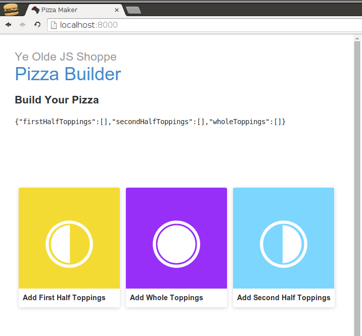
The colors are definitely bold. The icons and the wording are intentional. The icon and these “chips” (as they are called in Material) are very graphic. And I like them very much. Even though I mostly copied them, I am already attached to them.
It should be noted that, even though I am incorporating Material design in a Polymer element, I am not actually using Polymer to build the chips. They are very much old school
<div> tags: <section>
<div class="chip-container">
<div class="chip">
<div class="chip-top" style="background:#f4db33;">
<div class="chip-icon">
<core-icon src="/assets/first_half.svg"></core-icon>
</div>
</div>
<div class="chip-bottom">
<div class="chip-title">Add First Half Toppings</div>
</div>
</div>
<!-- Other topping chips here ... -->
</div>
</section>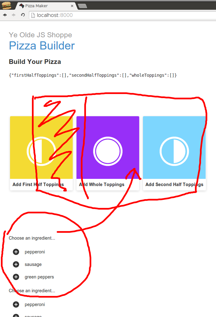
I also need to add motion, which is another core principle of Material. More precisely, “motion provides meaning” in Material. In this case, the chip will transition to card which both “reinforces the user as prime mover” and “focuses attention and maintains continuity.” To accomplish that, I need a little help from the core-animated-pages Polymer element. I am also going to shamelessly copy from that demo because it's pretty cool.
The idea behind the change from chip to card is to wrap the list of a chips and the details card inside a
<core-animated-pages> element. When a user action changes the selected value of details or list, the <core-animated-pages> element will take care of transitioning between chip and card with whatever transition scheme I want. In the case of the demo and in my shameless copy, I use hero-transition. I am not quite sure what that does, but with a name like that, it must be awesome.So I wrap last nights chip list section and a new details card in
<core-animated-pages>: <core-animated-pages selected="{{toppingsListOrDetails}}" transitions="hero-transition">
      <section>
        <div class="chip-container">
          <div class="chip">
            <div class="chip-top" style="background:#f4db33;">
              <div class="chip-icon">
                <core-icon src="/assets/first_half.svg"></core-icon>
              </div>
            </div>
            <div class="chip-bottom">
              <div class="chip-title">Add First Half Toppings</div>
            </div>
          </div>
          <!-- Other topping chips here ... -->
        </div>
      </section>
<section>
<div class="card">
<!-- Details here ... -->
</div>
</section>
</core-animated-pages>hero attribute and lining up the hero-id attributes. For example, I give the first-half topping selector a hero-id of "first_half": <core-animated-pages selected="{{toppingsListOrDetails}}" transitions="hero-transition">
<section>
<div class="chip-container" hero on-tap="{{transitionTopping}}">
<div class="chip" id="first_half_chip" hero-id="first_half" hero?="{{selectedTopping == 'first_half' }}">
<div class="chip-top" style="background:#f4db33;">
<div class="chip-icon">
<core-icon src="/assets/first_half.svg"></core-icon>
</div>
</div>
<div class="chip-bottom">
<div class="chip-title">Add First Half Toppings</div>
</div>
</div>
<!-- Other topping chips here ... -->
</div>
</section>
<section>
<div class="card">
<!-- Details here ... -->
</div>
</section>
</core-animated-pages>hero? “predicate attribute” does this. Normally, I would just use hero to indicate that a thing always transitions. But I only want the individual cards to transition under certain conditions, which hero? represents.This is only part of the hero transition. The transition starts with the identified chip. I need the card to match up with the same
hero-id as the the chip (otherwise it assumes that it is not included in the transition). For that, I use a Polymer bound variable: <section>
<div class="card" layout horizontal hero-id="{{selectedTopping}}" hero on-tap="{{transitionTopping}}">
</div>
</section>selectedTopping instance variable is a bit ugly. I resort to checking click event target to see if each card contains it:Polymer('x-pizza', {
toppingsListOrDetails: 0,
selectedTopping: null,
transitionTopping: function(evt) {
if (this.$.first_half_chip.contains(evt.target)) {
this.selectedTopping = 'first_half';
this.selectedToppingIndex = 0;
this.selectedColor = '#f4db33';
}
// Do the same for whole and second half...
this.toppingsListOrDetails = 1;
},
// ...
}
I begin to understand why the demo page author made some of the design and coding decisions that they did. They did an admirable job of keeping the code simple. I wonder if I might be able to do the same with my code.Regardless, this does the trick. The end result looks something like:
I really like that. If I couple this with the SVG pizza (in place of the JSON pizza representation), I could really have something here.
Day #152
No comments:
Post a Comment