I get a good feeling from Material Design's attention to animation. It is not just that it includes animation or focuses on animation. What I like is the thoughtful expression of how animation should support the user experience with an app.
Of course, I have no idea how to implement the ideas in Material. Well, I have some idea, but it would require so much JavaScript (or Dart) coding that I am quite certain that I would add one nice animation touch to my app and then let the rest go to pot.
Maybe Paper (or Core) elements have something to make this easy...
As luck would have it, I have a Polymer and Paper implementation of a new
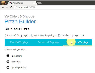
<x-pizza> element that is in need of animation improvement:
The paper materials in this example are the tabs (paper-tabs). Clicking on them makes a nice radial animation on the tab and then animates the selected tab indicator. But the tab content, currently done with
<core-pages>, has no such transition. In fact, since the content of each tab is the same (a list of possible toppings to add), it looks as if nothing happens at all.There does not seem to be anything in Paper that is going to remedy this situation. But I note that
<core-pages> tag. So I install it with Bower:
$ bower install Polymer/core-animated-pages --saveThen I change the
<core-pages> element in my <x-pizza> with <core-animated-pages>, specifying a right slide transition: <core-animated-pages selected="{{$.tabs.selected}}" transitions="slide-from-right">
<x-pizza-toppings id="firstHalfToppings"
name="First Half Toppings"
ingredients="{{ingredients}}"></x-pizza-toppings>
<x-pizza-toppings id="secondHalfToppings"
name="Second Half Toppings"
ingredients="{{ingredients}}"></x-pizza-toppings>
<x-pizza-toppings id="wholeToppings"
name="Whole Toppings"
ingredients="{{ingredients}}"></x-pizza-toppings>
</core-animated-pages>It turns out that, in order to use transitions, you have to import them. So let me back up to the point after which I installed from Bower. After doing so, I change
<core-pages> to <core-animated-pages> and I add the corresponding transition import to the top of my element:<link rel="import" href="../bower_components/polymer/polymer.html">
<link rel="import" href="../bower_components/paper-tabs/paper-tabs.html">
<link rel="import" href="../bower_components/core-animated-pages/core-animated-pages.html">
<link href="../bower_components/core-animated-pages/transitions/slide-from-right.html" rel="import">
<link rel="import" href="x-pizza-toppings.html">
<polymer-element name="x-pizza">
<template>
<!-- ... -->
    <core-animated-pages selected="{{$.tabs.selected}}" transitions="slide-from-right">
      <x-pizza-toppings id="firstHalfToppings"
                        name="First Half Toppings"
                        ingredients="{{ingredients}}"></x-pizza-toppings>
      <x-pizza-toppings id="secondHalfToppings"
                        name="Second Half Toppings"
                        ingredients="{{ingredients}}"></x-pizza-toppings>
      <x-pizza-toppings id="wholeToppings"
                        name="Whole Toppings"
                        ingredients="{{ingredients}}"></x-pizza-toppings>
    </core-animated-pages>
<!-- ... -->
</template>
<script src="x_pizza.js"></script>
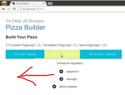
</polymer-element>With that, choosing a tab still changes the selected page, but now the page slides in from the right:
I'm not 100% sure that this is the correct Material direction. I clicked on the middle tab when the first tab was active, so I clicked on the tab to the right. Doing so, the page content came from the right, which seems proper.
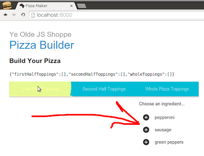
Regardless, it is interesting to note that, if I click on a tab to the left of the currently active tab, then the animations move in the opposite direction:

Even though the name of the transition is slide-from-right, it takes into account the document order of the elements being transitioned. This makes for a consistent experience with very little effort.
I experiment with other transitions, but most do no apply well to the current layout. Those that work require a little more effort on my part than the slide-from-right transition.
I think tomorrow I will explore some of these other transitions out of the confines of tabs. There may be some even nicer ways to chose pizza toppings thanks to Paper.
Day #150
This comment has been removed by the author.
ReplyDeletehi
ReplyDeleteWhether you are involved in affiliate marketing, selling items through ClickBank, or promoting your own personal business and website, ads are an important part of one's success. Some people make a recurring income simply by placing advertisements on the websites that get a lot of traffic.
ReplyDeletegel tabs vs paper tabs