I'm going to have to change every single example in Patterns in Polymer. It's not nearly as bad as it sounds.
Since the last update to the book (which wasn't that long ago, dammit), the fine team behind Polymer introduced Paper elements, which are a set of elements that codify the ideas behind the Material design system. I am unsure if the book will need paper-specific recipes, but I am definitely going to have to update all of the UI examples to use Paper elements. Not only is paper a Polymer best practice, but it simply looks better that what I have been doing so far.
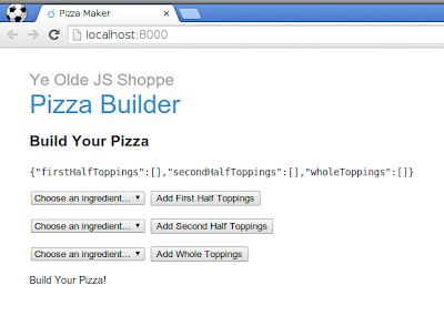
Consider the JSON version of my
<x-pizza> element:
There is much to be desired here. I'd like to say that I did that intentionally, but… sigh.
Anyhow, I address replacing the JSON representation of the pizza with SVG elsewhere in the book. Some of that could likely benefit from a reexamination in the soft glow of Material Design, but I will leave that for another time. Tonight, I would like to focus on improving the experience of adding ingredients to the pizza.
First off, I note that the Paper elements do not have a drop-down equivalent. Surely this an oversight that will be addressed… never? Drop-downs are pretty horrible user experience, especially for mobile, so my guess would be that their omission is deliberate (actually, they are in core). So what should I replace them with?
I think the best approach, is to replace it with a list. I should probably do this with core-selected, but keeping this small tonight, I just repeat on ingredients, prefixing the ingredient with an add icon:
<link rel="import" href="../bower_components/polymer/polymer.html">
<link rel="import" href="../bower_components/core-icons/core-icons.html">
<polymer-element name="x-pizza-toppings" attributes="ingredients name">
  <template>
    <template repeat="{{ingredient in ingredients}}">
      <p on-click="{{add}}">
        <core-icon icon="add-circle"></core-icon>
        {{ingredient}}
      </p>
    </template>
  </template>
  <script src="x_pizza_toppings.js"></script>
</polymer-element>
The core icons need to actually be installed for that to work, but thanks to Bower, that is easy enough:$ bower install Polymer/core-icons --save(note the plural—I had initially used the singular which did not show any icons)
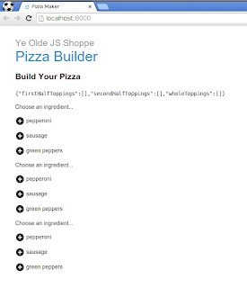
This works up to a point—that point being that I have all of the pizza toppings displayed on the same page:

This would work better with tabs—especially if I ever allow pizza buyers to add more than 3 different toppings. For tabs, I need two things: Paper tabs and Core pages.
$ bower install Polymer/paper-tabs --save
$ bower install Polymer/core-pages --save
The need for core pages took me a while to figure out. The tabs provide just the tabs, not the tab contents:
    <paper-tabs selected="0" id="tabs">
      <paper-tab>
        <p>First Half Toppings</p>
      </paper-tab>
      <paper-tab>
        <p>Second Half Toppings</p>
      </paper-tab>
      <paper-tab>
        <p>Whole Pizza Toppings</p>
      </paper-tab>
</paper-tabs> <core-pages selected="{{$.tabs.selected}}">
<x-pizza-toppings id="firstHalfToppings"
name="First Half Toppings"
ingredients="{{ingredients}}"></x-pizza-toppings>
<x-pizza-toppings id="secondHalfToppings"
name="Second Half Toppings"
ingredients="{{ingredients}}"></x-pizza-toppings>
<x-pizza-toppings id="wholeToppings"
name="Whole Toppings"
ingredients="{{ingredients}}"></x-pizza-toppings>
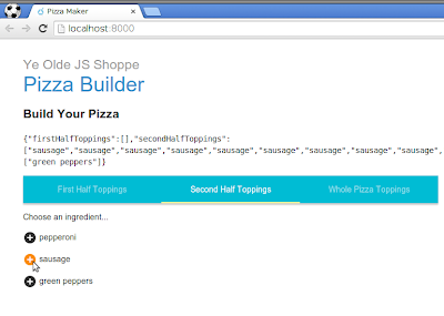
</core-pages><link rel="import" href="../bower_components/polymer/polymer.html"> <link rel="import" href="../bower_components/paper-tabs/paper-tabs.html"> <link rel="import" href="../bower_components/core-pages/core-pages.html"> <!-- START: intro --> <link rel="import" href="x-pizza-toppings.html"> <polymer-element name="x-pizza"> <!-- ... --> </polymer-element>Which does the trick:

That is a definite improvement over the original drop-down approach. That said, it may be a bit much to carry all of this around through examples in different chapters of the book. The drop-down approach did have the benefit of being more compact and with fewer concepts. I will ruminate on that in the upcoming days.
For now, I am happy to have been able to transition relative quickly. It is still a bit hard moving between core and paper and remembering which elements are where—or even if they exist (e.g. drop downs). But that will improve over time. I am happy to have an easier way to get nice looking elements. I am also intrigued by Material's focus on animation and UI. Including those concepts in the system should significantly help expressing and implementing concepts. All the more so since it seems well thought out. This should be fun!
Day #146
I liked the Google I/O presentation by Kevin Moore where he expressed real pleasure in clicking the checkbox, just to see the way it reacted, with animated ripples. Said he could do it all day, and I know what he means :-)
ReplyDeleteAgree 100%. I appreciate how animations are core concepts in Paper/Material — that seems a great way to improve thinking about user experience from the individual elements all the way up to the entire application. I'm glad to finally have a chance to play with it myself :)
Delete